
Why Color Coordination Feels Hard
Most people who struggle with color matching aren't lacking taste — they're lacking a framework. Without a simple system to refer to, getting dressed can feel like solving a puzzle with no picture on the box. The result is either playing it completely safe with all-black outfits, or buying pieces that never quite work with anything else in the closet.
The good news: color coordination isn't a gift some people are born with. It's a skill built on a handful of observable principles. Once you understand why certain colors work together, you start seeing those patterns everywhere — in storefronts, interiors, and the outfits of people whose style you admire.
It also helps to remember that fit and color are both fundamental. As noted in our guide on why good fit matters more than brand or price, a well-fitted garment in any color will always look more intentional than an ill-fitting one in the most perfectly matched palette.
Color wheel
A circular diagram that organizes colors by their relationships to each other, helping identify which hues harmonize or contrast.
Analogous colors
Colors that sit adjacent on the color wheel and share similar undertones, creating a naturally harmonious, low-contrast look.
Complementary colors
Colors positioned directly opposite each other on the color wheel, creating high-contrast pairings that stand out when used together.
Undertone
The subtle warm, cool, or neutral base beneath a color's surface that affects how it looks next to other colors and against your skin.
Neutral
Colors like white, black, gray, navy, and beige that pair easily with most other hues and form the base of a coordinated wardrobe.
Saturation
How vivid or muted a color appears. Highly saturated colors are bold and bright; desaturated colors appear washed out or earthy.
The Color Wheel, Simplified
The color wheel is the foundation of all color theory. You don't need to memorize it — you just need to understand two basic relationships it describes.
Analogous Colors
These are colors that sit next to each other on the color wheel: blue, blue-green, and green, for example. Because they share undertones, they blend naturally and create low-contrast, harmonious outfits. Think of a rust shirt paired with terracotta trousers and a warm brown jacket — all neighboring shades that feel unified.
Complementary Colors
Complementary colors sit directly opposite each other on the wheel — blue and orange, red and green, yellow and purple. These pairings create high contrast and visual energy. Used thoughtfully, they make an outfit pop. The key is to let one color dominate and use the other as an accent rather than splitting them 50/50.
Most everyday outfits fall into one of these two categories, even when the wearer doesn't realize it. Identifying which pattern you're working with makes it easier to add or remove pieces confidently.
Building a Neutral Base
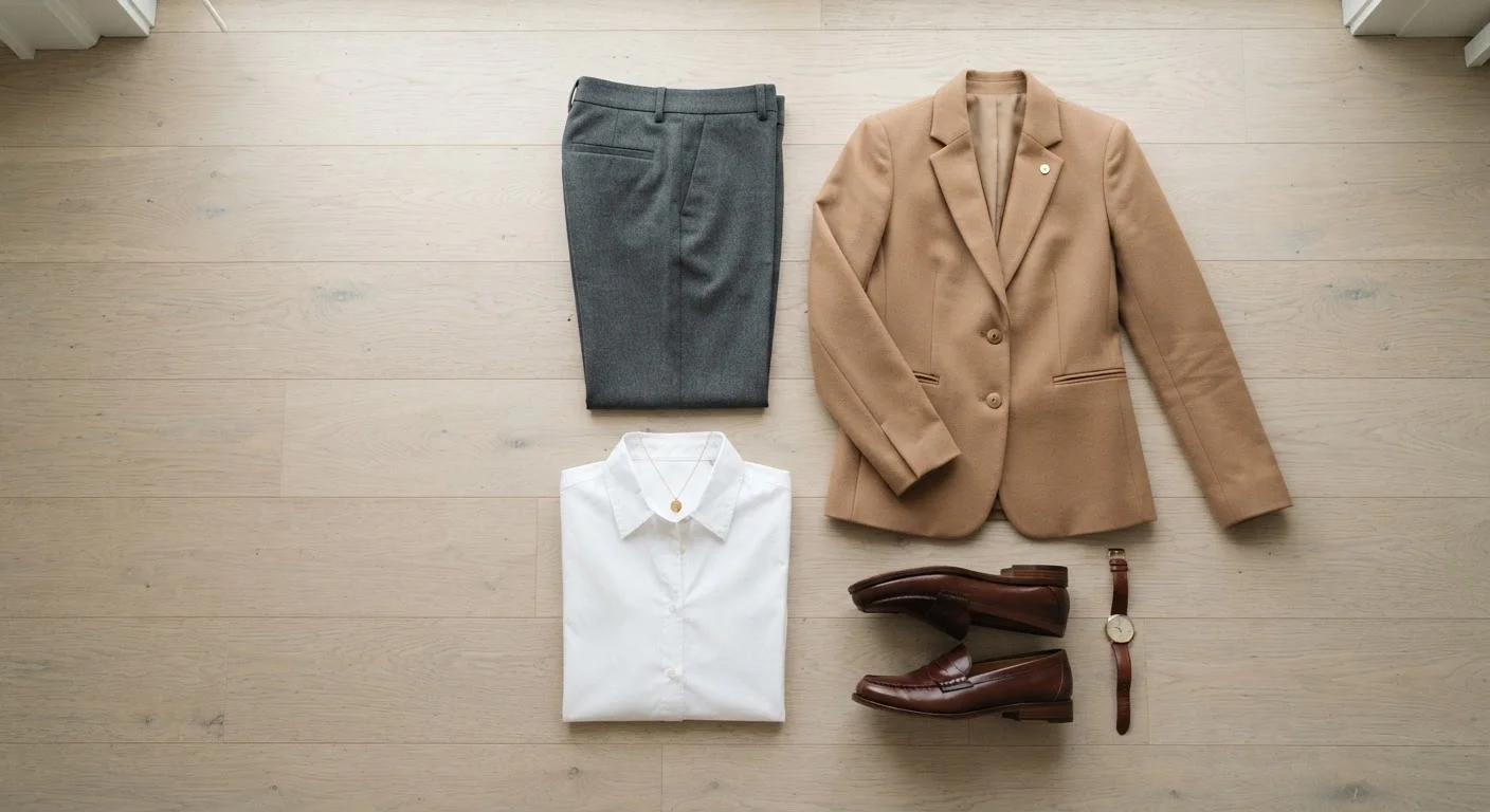
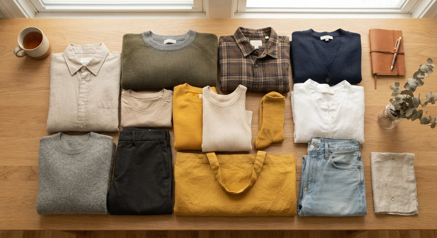
Neutrals — white, black, gray, navy, beige, camel, and cream — are the backbone of a coordinated wardrobe because they pair with almost everything. If the majority of your wardrobe is built on neutrals, you drastically reduce the chances of a color clash.
A practical approach is to treat neutrals as the canvas and bolder colors as accents. Your trousers, outerwear, and shoes might all be neutral, while a top or accessory introduces a single deliberate color. This structure makes getting dressed faster and more reliable.
Start with two neutrals and one accent
When building outfit combinations, try anchoring each look with two neutral pieces and introducing just one accent color. This formula works across seasons and dress codes, and makes it easy to swap pieces in and out without breaking the palette.
Building a neutral base also supports a more versatile closet overall. Our guide on how fewer pieces can create more outfits goes deeper on how to maximize combinations with a smaller wardrobe.
Practical Rules That Actually Work
Once you understand the basics, a few practical guidelines make daily color decisions much easier:
- The three-color limit: Keep any single outfit to three colors or fewer, including neutrals. More than three tends to feel busy rather than expressive.
- Match undertones: Colors have undertones — warm (yellow, orange, red base) or cool (blue, green, purple base). Mixing pieces with similar undertones creates cohesion even when the hues are different.
- Use texture to vary neutrals: A head-to-toe neutral outfit benefits from variation in fabric texture — linen next to denim, for example — to prevent the look from feeling flat.
- Treat prints as color references: If a patterned piece contains blue and rust, those become your palette. Pull one of those colors into another piece to tie the outfit together.
Avoid buying colors in isolation
Before adding a new color to your wardrobe, check it against at least three pieces you already own. If it doesn't pair naturally with any of them, it's likely to sit unworn. Impulse purchases in unusual colors are one of the most common reasons closets feel unusable despite being full.
These principles apply whether you're dressing casually or for the office. If you're navigating a workplace dress code, our guide on dressing well for work without a uniform offers context on how to apply these ideas in professional settings.
Putting It All Together
Color coordination improves with practice and attention. The most effective way to develop the skill is to look critically at combinations that already work in your wardrobe and reverse-engineer why they succeed. Is it shared undertones? A complementary contrast? A strong neutral anchor?
Over time, these observations become instinctive. You'll start to notice that consistent color habits — like always returning to two or three accent colors that suit your complexion — simplify shopping as much as they simplify dressing. Trend-first buying, by contrast, tends to fill a closet with pieces that don't connect. Our piece on when trendiness works against you explores how that pattern quietly undermines a functional wardrobe.
You don't need a large collection or an expensive one. You need colors that work together — and now you have the tools to choose them.
Color Wheel Reference Tool
An interactive color wheel helps you visualize analogous and complementary relationships before committing to a combination. Several free versions are available online from design-focused platforms.
Wardrobe Audit Checklist
A simple checklist for reviewing the colors in your existing wardrobe helps identify gaps and redundancies before you shop, making future color coordination more intentional.